9-13. The table below shows changes in the numbers of residents cycling to work in different areas of the UK between 2001 and 2011. Please choose sentences in the basket to fill in the blanks to describe the table appropriately.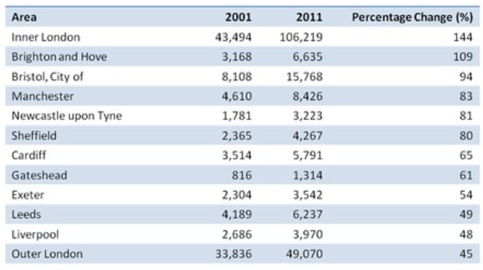 (9.) ____________ Overall, the number of UK commuters who travelled to work by bicycle rose considerably over the 10-year period. Inner London had by far the highest number of cycling commuters in both years. In 2001, well over 43 thousand residents of inner London commuted by bicycle, (10.) ____________, an increase of 144%. By contrast, although outer London had the second highest number of cycling commuters in each year, the percentage change, at only 45%, (11.) ___________. Brighton and Hove saw the second biggest increase (109%) in the number of residents cycling to work, but Bristol was the UK’s second city in terms of total numbers of cycling commuters, with 8,108 in 2001 and 15,768 in 2011. (12.) ___________. (13.) ___________. A. and this figure rose to more than 106 thousand in 2011 B. Other 8 cities, though not so high as the previous two cities, still demonstrate much changes, with the percentage ranging from 48%-94%. C. The table compares the numbers of people who cycled to work in twelve areas of the UK in the years 2001 and 2011. D. Here is the description of the chart on the paper. E. was the lowest of the twelve areas shown in the table F. This change of preference for bicycle as a means of transportation shows people’s awareness of environmental protection, which should be encouraged by the society. 现在请填写第9题答案。(填一个大写字母即可)
 题目内容
(请给出正确答案)
题目内容
(请给出正确答案)
 简答题官方参考答案
(由简答题聘请的专业题库老师提供的解答)
简答题官方参考答案
(由简答题聘请的专业题库老师提供的解答)

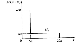
 ,equivalent resistant torque on motor shaft
 is following the diagram on below figure with circle of
 .If driving torque
 is constant and moment of inertia of each link can be ignored,find: (1) driving torque
 , (3)calculate moment of inertia
 of flywheel mounted on motor shaft if flunctuation coefficient
 .
.